Creating visually compelling and data-driven projects is crucial for effectively conveying information and insights. When working with Elastic Personas, incorporating charts can significantly enhance your project’s clarity and impact.
Chart types we have:
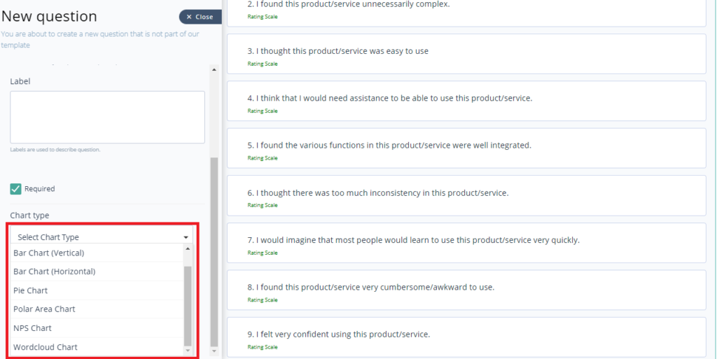
- Bar chart: Display data using rectangular bars to show comparisons among categories.
- Pie chart: Represent data as slices of a circle to illustrate proportional relationships.
- Polar area chart: Show data in a circular graph where each segment extends outward from the center based on its value.
- NPS chart: Visualize Net Promoter Score data to measure customer loyalty and satisfaction.
- Word cloud chart: Display text data where the size of each word indicates its frequency or importance.
Here’s a step-by-step guide on how to add various types of charts to your project:
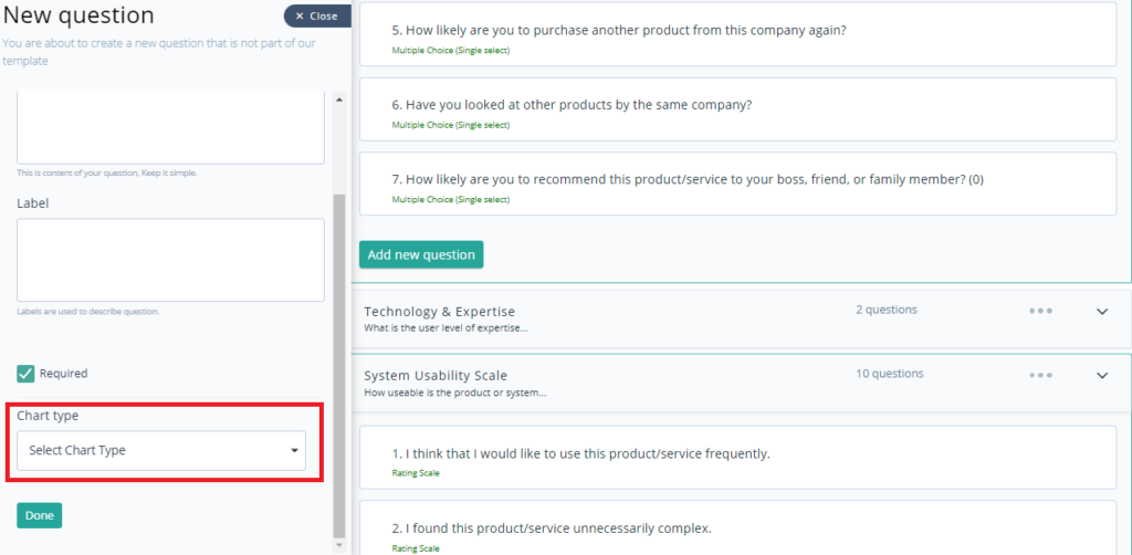
- While adding a question, you have an option to choose the Chart Type.
- Select the type as per your choice.
- Click Done, once you select the type of chart.
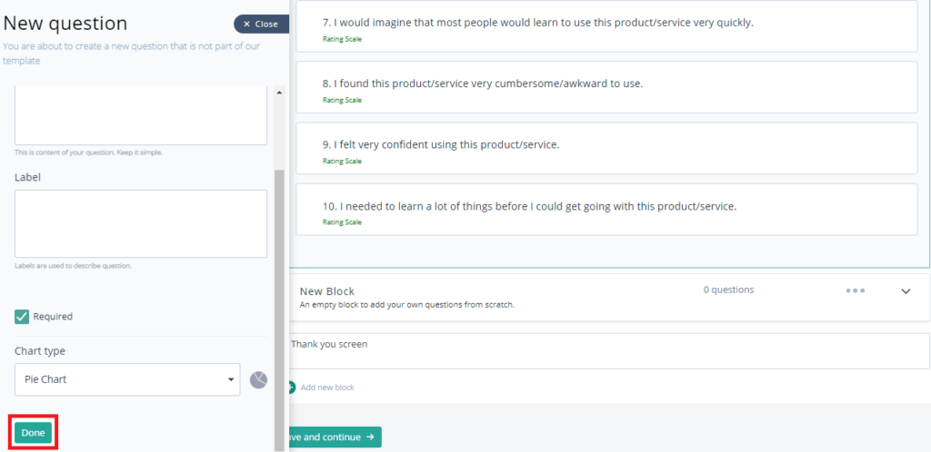
- Chart will be added successfully in the project.


